


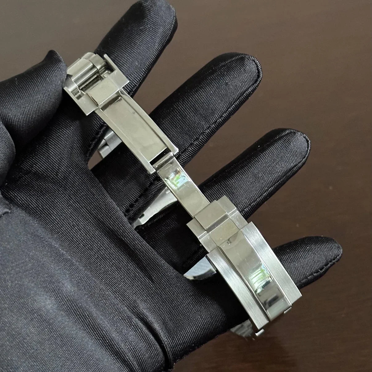
Technical Specifications
ANTI SCRATCH
Let customers speak for us
Súper great quality, and also super great servive, by the vendor..,

The finishing, the dial, the strap — everything feels premium. The watch could easily compete with brands three times the price.

The case and crystal are flawless. The lume is strong, the movement precise. You can feel the quality on your wrist.

Great communication, fast shipping, and the watch looks even better in person. Highly recommend this seller and brand.

Excelent seller. Incredible pieces of time. Well packed and fast delivery. Competitive price and profesionals easy to reach a deal with. Watches working as expected. Impressive quality. Absolutely outstanding.

Everything went smoothly. Quick replies, secure packaging, and the watch was exactly as described. Thanks again!

Great seller. Outstanding watches with extreme accuracy. Nothing to complain about. As one expectscfrom a Seiko. Seller easy to contact and always wirh a clever and positive attitude. Bought some watches and hope to come back

Thank you! Good, save packing condition! Top: Small Tools for shorting the watch strap.

You can tell they genuinely care about their customers. I’ve never had such a smooth and friendly purchase experience.

You can tell this brand loves what they do. Every screw, every polish, every click of the bezel feels intentional.

Everything from the crown engraving to the polished indices is perfect. No shortcuts taken here.

I’m happy with the watch – the quality is good, the customer service was helpful, and the delivery time was reasonable


HAND-CRAFTED
Every watch we create is hand-assembled from start to finish, ensuring a level of quality, attention to detail, and character that mass-produced timepieces simply cannot match.
Our watches are crafted piece by piece — from the case and dial to the hands, crystal, and movement regulation. Each component is carefully selected and manually integrated by experienced watchmakers who control the process at every step. The result is a timepiece that feels personal, refined, and built with intention.
QUALITY-CHECKED PARTS

Japanese Movements
We exclusively use Japanese Movements, known globally for their accuracy, consistency, and low-maintenance design. Depending on the model, our timepieces feature:
- Automatic movements such as NH34, NH35, and NH38, offering smooth operation, excellent power reserve, and trusted mechanical reliability.
- Meca-Quartz chronograph movement VK63, combining mechanical chronograph feel with quartz precision for superior everyday performance.

SAPPHIRE CRYSTAL
Our watches feature scratch-resistant sapphire crystal, trusted in fine watchmaking for its durability and clarity. It protects the dial from everyday wear while preserving a clean, refined look.
- Highly resistant to scratches
- Excellent transparency for clear dial visibility
- Built for reliable, everyday use
Engineered for durability. Refined for daily wear.

WATER RESISTANT
Our watches are designed for reliable everyday wear, with two water-resistance options to match your lifestyle.
- 3 ATM – suitable for daily use, hand washing, and protected against rain or everyday water splashes
- 5 ATM – built for active wear, including swimming and water-based activities
Choose the level that fits your routine — from daily life to more demanding moments.

STAINLESS STEEL
Our watches are crafted from 904L stainless steel, a premium-grade alloy known for its exceptional strength, corrosion resistance, and refined finish.
- Highly resistant to corrosion and wear
- Smooth, polished surfaces with lasting shine
- Chosen for durability, comfort, and a premium feel
Built to endure. Finished to impress.
BUILD STORY
Black-white contrast makes a chronograph-style dial feel faster even when the watch is still.
The contrast has to stay crisp without turning the face into noise. The darker surface gives the watch weight, while the brighter registers give the eye clear points of focus. That tension matters because a black, white and silver watch changes more than the first impression. It changes the pace of the dial, the way the case reads, and the kind of confidence the watch brings to the wrist.
On wrist, it reads sharper than a single-color dial and more graphic than a plain silver watch. It has energy without needing a bright accent color. A strong black-white contrast chronograph-style custom watch should not feel like a borrowed costume. It should feel like a decision with its own reason: clear at first glance, then more interesting when the buyer studies the details.
The story is about visual timing: dark base, light interruptions, and a dial rhythm that feels intentional. The strongest watch mods are rarely the ones with the most visual noise. They are the ones that know which detail should lead and which detail should stay quiet.
That is the practical story behind this ModTime build. It is an independent custom watch assembled around a clear visual idea, not presented as a factory model from any outside brand. Trust comes from proportion, finishing choices, support, and a page that explains the piece without vague promises.
The dial carries the emotion, but restraint is what makes the watch wearable. Black White Contrast Chronograph Build has to work in daylight, indoors, in a quick wrist shot and during ordinary parts of the week. A design that only works for the first scroll is not enough; the watch has to stay convincing after the first impression has passed.
It fits someone who wants a custom watch with sport character and strong photography presence, but without a loud color palette. Specs can tell you about movement, material, size, warranty, shipping, returns and care, but they do not always explain why one version feels easier to choose than another. This story gives the watch a point of view before the surrounding product page gives the concrete details.
A buyer comparing black dial watch mod or white dial watch mod or black-white chronograph options should find a helpful explanation here, not a repeated keyword block.
That matters most on a product page where several builds may seem similar at first glance. The story gives the buyer a clearer reason to slow down, compare the mood of the dial, and understand why this exact version deserves attention instead of blending into the rest of the catalog.
For ModTime, the trust layer is part of the product. A hand assembled custom watch should make the buyer feel informed about the build process, the limitations, the support route, and the choices that shape the final object. That clarity is what separates a considered independent build from an anonymous marketplace purchase.
The page should also link buyer intent to the real reason the watch exists. If someone wants a black-white contrast chronograph-style custom watch, the story should explain mood, wrist presence and design tradeoff in plain language. It should never hide behind search terms, copied heritage, or claims the product page cannot support.
This is not the loudest possible version of the idea. It is the version that gives the black, white and silver character room to work while keeping the whole watch composed. If you want a black-white contrast chronograph-style custom watch that feels personal, wearable and direct, this build earns attention by staying specific.
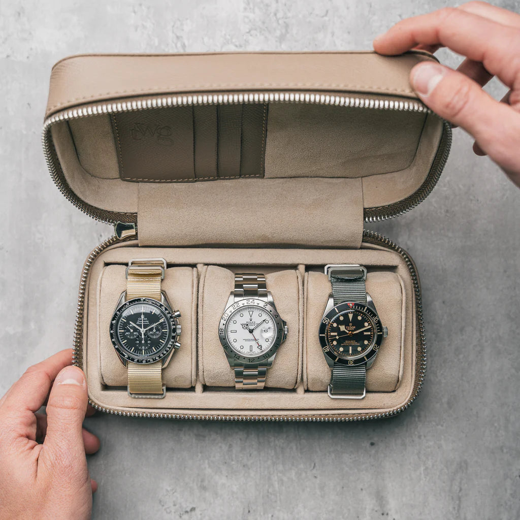
Luxury unboxed
ELEVATE YOUR EXPERIENCE
At ModTime, we believe a watch should be more than just an accessory — it should be an experience.
Every ModTime creation arrives in a handcrafted case, a reflection of our dedication to quality, precision, and timeless design.
Each order also includes a complimentary adjustment toolkit and a step-by-step guide, allowing you to tailor your bracelet for the perfect fit.
From the first moment of unboxing to the years of wear ahead, your ModTime watch is crafted to deliver lasting satisfaction and refined elegance.